
 This is part 3 of our Enhancing the Customer Experience Blog Series.
You can read Part 1 and Part 2.
Customer experience is an important part of increasing our e-Commerce sales, but there are many different components to it. There are several ways to approach it and many best practices concerned with providing customers with a positive experience on your webshop. We’ve written blog posts on how to enhance the customer experience of your webshop to help increase sales, covering topics from navigation, personalization, and profile selling. This blog post will focus on the look and feel of the webshop as an important facet of the customer experience.
How can you “feel” a webshop?
When we’re talking about a webshop’s “Look” and “Feel”, they may seem like separate attributes, but they are actually intrinsic to each other. Looks are comparatively easy to deal with, being the aesthetics and how we visually perceive the website. Visual aspects include layout and typography, and attractive use of colour and images. But what about the feel? The feel of a website is harder to explain because while it is intangible, it is extremely important in establishing that positive impression and brand awareness. When visitors of your website form opinions, it’s not only what they thought of the design, but how they felt overall and what they remember about your company and products.
The feel of a webshop is also affected by something we like to call “functional flow“. Flow is something intangible, much like feel, but relates to an optimal experience that is natural and easy. It takes the user’s desires and translates it into satisfaction with minimal effort on their part. Through clever web design, value-added features, and persuasive content, the functional flow of an e-Commerce webshop is carefully crafted. Taking key elements and consideration of how features, like parametric search, function to create a high-level flow experience, we can effectively appeal to our audiences.
For example, a webshop could have a very bright colour scheme, snazzy fonts, and lots of pictures. That has more to do with the look. The feel of the webshop could be energetic, fun, and exciting. On the flip side, a more conservative and structured website will convey trustworthiness and reliability.
It’s a combination of look, feel, and flow that work to create a specific customer experience. When done thoughtfully, your website should be in synergy with your company’s brand and values.
What trends actually add value to your webshop design?
When thinking about the design of our webshop, we must consider the manner in which it will be viewed. Giving the customer the option to view it on their desktop, laptop, tablet, or smartphone will win points. It’s not only how it looks, but how the customer experiences it.

Nav-to-Net™ Viewports – Desktop, Tablet, Mobile
Awesome Experience No Matter the Device – Responsive Design is one of the emerging trends in e-Commerce technology and it has been gaining traction and recognition for all the right reasons. Responsive Design is when your e-Commerce website can adapt to any device, providing optimal display and performance, no matter which device the customer chooses to view it on. With an increasingly mobile culture, Responsive Design is the future of online retail and can help your business gain additional value and stay ahead of the curve.
Chic and Functional Design Approach – A Flat Design is most often associated with a clean and modern look, carefully simplistic and quite trendy. It has a minimalist design philosophy that focuses on usability. Flat design usually includes crisp edges, open space, and two-dimensional images. When done well, it’s a delicate balance between being simple yet individual. Small nuances in the design help personalize the webshop so even in simplicity, it shows your unique branding. One of the benefits of flat design is that the user-friendly interface is a “back to basics” approach; it’s more functional than flash and will appeal to a wide variety of users.
Your Webshop Can Have Beauty AND Brains – Value-Added Features
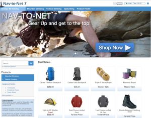
A beautifully designed website is ineffective if it doesn’t function well. Customers have to be able to easily navigate and find what it is they’re looking for. Besides having a logical and intuitive web layout, consider some features that add value such as parametric search. A solution like Nav-to-Net™ allows you to manage practically every component of your webshop right from within Microsoft Dynamics™ NAV. Our products and categories, as well as content, can be conveniently managed so that we can show off the products and services instead of confusing would-be buyers with too much information. Invest in features that add to the customer experience, allowing them to interact and engage with your website the way they want. Such features could include gift registry, favourite lists, sales quote creation, etc. These features add a facet of personalization which also helps instill brand loyalty.
Consistency in Style
In managing our product catalog and descriptions, consider displaying them in a variety of ways. Rich content on your webshop including high resolution pictures and videos will bring a level of sophistication and excitement to your webshop. Make sure your text is legible, the size is sufficient, and there is good use of white space. Looking good is one thing, but the priority is to get your message across clearly. Blending the two is easy with effective content management. Content, file, and image management is done entirely within Microsoft Dynamics™ NAV with our e-Commerce solution, Nav-to-Net™. It’s convenient and easy to use so you can adhere to best practices and get the most out of your content. Our integrated WYSIWYG (What You See Is What You Get) editor allows you to work smarter, no harder; there’s no need for fancy coding.
Clear Marketing Message
When coming up with content for our webshops, the message and intent should be obvious. What and where are our CTA’s (call-to-actions)? Is it clear what the next step is? Can the shopper access more information easily? There should be a balance of option and ease. With lots of options, you’re increasing the chance of them taking action. Quick and hassle-free experiences are what we want as this helps retain customers and could increase our repeat business.
Savvy shoppers have high expectations – they know to look for certain things in a website and can easily abandon your website for your competitors if the experience isn’t up to par.
A Balancing Act in E-Commerce
It’s ultimately balancing form and function in our webshop. Take customers’ perspective and apply best practices. A customizable and feature-rich e-Commerce solution can make all the difference in how your customers perceive you and transform your business.
At Digital Vantage Point, we understand this very well. E-Commerce in any industry can be incredibly competitive and we want to help you. Our highly integrated e-Commerce solution, Nav-to-Net™, is flexible and customizable, and is a complete webshop filled with value-added features. Backed with years of expertise and experience, our development and design team with take your branding and company needs into consideration, creating for you a beautiful and usable site with all the latest technologies like Responsive Design.
Talk to us about how you can find that balance in your webshop – sales@dvp.net
See how our solution Nav-to-Net™ can be customized and much more – Request a Demo
Want to learn more about Responsive Design? Read our blog post!
 Digital Vantage Point Blog